How to Build a High-Converting Product Page
Create a high-converting product page with clear design, strong CTAs, and SEO-friendly content that drives more purchases.
Angelina Markells
3/31/20263 min read
How to Build a High-Converting Product Page
(Simple Guide for Better Sales)
A product page is one of the most important parts of any e-commerce website. It’s where visitors make the final decision—either to buy your product or leave your site. On average, product pages convert around 1.5–3%, but with the right improvements, you can increase that number significantly.
The good news? You don’t need advanced design skills or expensive tools. A high-converting product page is all about clarity, trust, and ease of use. Let’s break it down step by step in simple terms.
1. Create a Strong First Impression (Hero Section)
The top section of your product page—also called “above the fold”—is what users see first without scrolling. This area should immediately grab attention and give essential information.
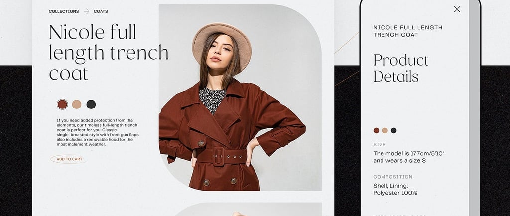
Start with a clear and simple product title. Instead of using confusing names or codes, describe what the product is and its main benefit. For example, “Soft Cotton Hoodie – Warm & Comfortable for Everyday Wear” works much better than just “Hoodie XYZ123.”
Next, include a high-quality main image. The product should be clearly visible, well-lit, and placed on a clean background. This helps users quickly understand what they’re looking at.
Make sure the price and “Add to Cart” button are easy to see. The button should be large, bright, and use clear action words like “Buy Now” or “Add to Cart.” You can also add one or two short lines highlighting key benefits, such as comfort, durability, or style.
Keep this section simple. Avoid clutter, too many links, or unnecessary distractions.
2. Use High-Quality Images and Videos
Since customers can’t physically touch your product, visuals play a huge role in influencing their decision.
Include multiple images showing different angles—front, back, sides, and close-ups. Add a zoom feature so users can inspect details more closely. Lifestyle images are also very effective. For example, show someone wearing your hoodie in a real-life setting.
Videos are even more powerful. A short 15–30 second clip showing the product in use or an unboxing experience can greatly increase trust and engagement.
Better visuals not only attract customers but also reduce returns because buyers know exactly what to expect.
3. Write Clear and Helpful Descriptions
Avoid long, boring paragraphs. Most users scan rather than read, so your content should be easy to understand at a glance.
Focus on benefits first, not just features. Instead of saying “Made of 100% cotton,” say “Stay warm and comfortable all day with this soft cotton hoodie.”
Use bullet points to make information easy to digest:
Material: Soft and breathable cotton
Sizes: Available from S to XXL
Care: Machine washable
Answer common customer questions like: Who is this for? What makes it special? How does it fit? Keep sentences short and simple for better readability.
4. Build Trust with Social Proof
Trust is a major factor in online shopping. Most customers look at reviews before making a purchase.
Display star ratings near the top of the page. Include real customer reviews, ideally with names and photos. Adding a “Verified Purchase” tag increases credibility.
You can also include trust signals like:
Free shipping
30-day money-back guarantee
Secure checkout badges
Place these elements close to the “Add to Cart” button to reduce hesitation at the final step.
5. Make Buying Easy and Smooth
Your goal is to remove any friction in the buying process.
Show clear pricing and highlight discounts if available, such as “Was $49, Now $39 – Save 20%.” Make product options like size, color, and quantity simple to select.
A sticky “Add to Cart” button—especially on mobile—ensures the button is always visible as users scroll.
Clearly mention shipping times and return policies so customers feel confident about their purchase. You can also add a sense of urgency, like “Only 3 items left,” but use it honestly.
6. Optimize for Mobile Users
Today, most shoppers browse and buy using their phones. So your product page must be mobile-friendly.
Ensure the page loads quickly—ideally within 3 seconds. Buttons and text should be large enough to tap easily. Images should adjust properly to different screen sizes.
Keep everything simple and clean. Test your page on a real mobile device to make sure the experience feels smooth.
7. Add Extra Helpful Sections
Below the main content, you can include additional sections to improve user experience.
A size chart or comparison table is useful for products like clothing or shoes. An FAQ section helps answer common questions such as sizing, care instructions, or delivery details.
You can also show related products under “You may also like” to increase sales. Adding user-generated content like customer photos or videos makes your page feel more authentic and trustworthy.
Bonus Tips to Increase Conversions
Keep your page clean and fast. Avoid unnecessary pop-ups or distractions. Use simple, benefit-focused language that clearly shows how your product improves the customer’s life.
Test different elements like headlines, button colors, or image order to see what works best. Also, make sure your product page matches your ads. If someone clicks on an ad for a “cozy winter hoodie,” your page should reflect that same message.